
Guide
All charts
"All charts" shows the current list as a scrolling graphite tape in the order of sorting selected. On the desktop above the tape, a sorting panel, a general timeframe, a reset interval and signature, values, and color settings are available. The mobile version uses a separate compact panel.
What this section covers
- What distinguishes "All charts" from "Selected charts", a stored grid and single-coin mode?
- How to switch between "Selected charts" and "All charts" in the top control panel.
- How the sorting panel is built from the metrics included in the current list and how repeated clicks change direction, absolute mode, or group sorting.
- How to choose the shared timeframe with the header button and hotkeys.
- As an automatic update, the "Manual" option and the update button control the reset of the graphs.
- How the value panel shows the metrics on each graph and how to hide the sorting panel, signature or individual parameters in the sixth column, change their colors and drop the redefinitions.
- Why does a manual sorting change translate to the first chart, and an automatic rearrangement keeps the selected coin and viewing position.
- Why scrolling, pressing, drawing and working with graphics elements temporarily show the status of pause and block the rearrangement.
- How to move a scroll, floating leaflet and keys Home, End, Page Up and Page Down.
- How the selected chart is used when returning to "Selected charts".
- How the mobile panel controls the TF, metrics, sorting mode, manual updating, number of charts, signatures, visibility and color of parameters.
- How does an anonymous demo work: P₂₄ downtime, updating every 10 seconds, networking up to 3x3 on the desktop and 5m start timeframe on the mobile.
Key screens and controls
- The switch in the upper control panel in the version for PC: the clue "All charts" and "Selected charts" explain the current action.
- The sorting panel above the graphs: the metrics included, the active direction, the absolute mode and the order of the group sorting.
- The common timeframe button applies one timeframe to all the schedules of this mode.
- Select the update interval: Specifies whether the order of the graphs will be updated automatically or only manually.
- The manual update button: appears at the "Handbook" interval and applies the current sorting to the schedules.
- Six-mode: sort panel, value panel, parameters name, visibility of each parameter, color selection and "Delete colors".
- The value panel on each chart: compact chips of available metrics of the current coin.
- Pause status instead of intervals while the user scrolls through the tape, draws or interacts with the graphic.
- Floating scrolling blocks: buttons at the beginning, back, front, and end, plus a progress indicator.
- Graphic cap: ticker, market/exchange if necessary, badges of the metrics included, single-coin mode button, terminal button and selected one.
- Mobile panel: TF, parameter, direction/absolute mode button, update and sixth with a number of graphics and parameters.
Step-by-step flow
- Open the "Selected charts desktop mode. "All charts" is always built from the current list: after switching the list the tape will be rebuilt from its coins.
- Click the All charts button in the header. The chart area becomes a scrollable feed and the button becomes active. The coin-list panel keeps its current visibility; hide or show it separately with the list button or Ctrl + X.
- The list includes the following parameters: alerts, patterns, Score, round numbers, levels, trends, large requests, OI, Funding, P24, V24, NATR, VR, PΔ, Pavg, rBTC, number and relative number of transactions.
- The active metric is followed by a supported sorting cycle from "Settings → Common → Types and order of sorting". The triangle shows the direction, and the additional sign is the absolute mode.
- Choose the shared timeframe. The timeframe button near the refresh-period control shows the current shared timeframe. Selecting another value applies it to charts in this mode and saves it as the default for the next open.
- Use Shift + Arrow Left or Shift + Arrow Right to switch the shared timeframe from the keyboard. This is useful when you want to compare the same sorted list on a lower or higher timeframe without opening the dropdown.
- Select intervals of 2, 5, 10, 30 or 60 seconds to automatically reset. In "Manual" mode, the values keep updating, but the order remains fixed until you press the update button.
- Open the sixth. Turn on or off the sort panel and the value panel separately; for the value panel, set the signature, visibility of each metric and color. "Delete colors" returns the current colors of the theme and metric.
- When the metric or direction is changed manually, the tape switches to the first ranked chart.
- When scrolling, holding the pointer, drawing or an open control, the interval is replaced by "Pause". Wait for the interaction to complete automatic sorting will continue without a separate command.
- Move around the graphs with the mouse wheel, the keys Home, End, Page Up and Page Down. Home moves to the first graph, End to the last, Page Up/Page Down leaf to a single visible page.
- If a floating blade is on, use its buttons to do the same thing. You can move the block over the drawing area, and the mouse wheel over the block rolls the graph tape, no matter where the block is located.
- Click on the chart to make it selected, and this coin will be moved back to normal mode when you turn off "All charts".
- To sort a coin in more detail, use the single-coin mode button in the graphics cap, which opens the same ticker in the minimum one-coin window with the size specified in the settings.
- If the terminal integration is configured, use the terminal button in the chart cap to send the exchange ticker to Tiger.Trade, MetaScalp or Vataga according to your integration settings.
- Use the selected button in the chart cap to add a coin to the selected group. If the coin is already in the selected one, this button remains visible even without pointing to the chart.
- Switch to "Selected charts", when you need to continue with the list, glass, alerts, or saved network.
- On your mobile, open "All charts" from the hat. Select TF and the setting, switch direction or absolute mode with the triangle button, and manually reorder with the update button.
- Tap the mobile graphic headline opens the coin's usual screen, and when the app returns, it restores the previous tape position, and the vertical swipe on the graphic is sent to the page scroll.
Default keyboard shortcuts
All charts
Keys
Action
Ctrl+Z
Switch between ordinary mode and All charts.
Shift+←/Shift+→
Switch the shared timeframe for charts in this mode.
Home/End
Move to the first or last chart in the sorted feed.
Page Up/Page Down
Move one visible page up or down through the chart feed.
Screenshots
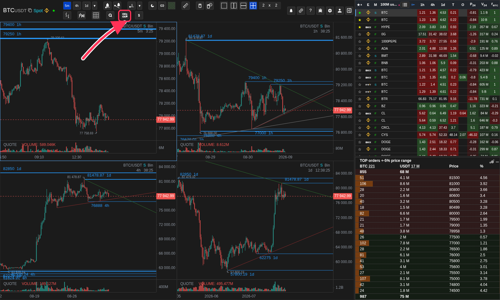
Where to enable All charts
The arrow points to the desktop mode switch; Ctrl + Z performs the same action.
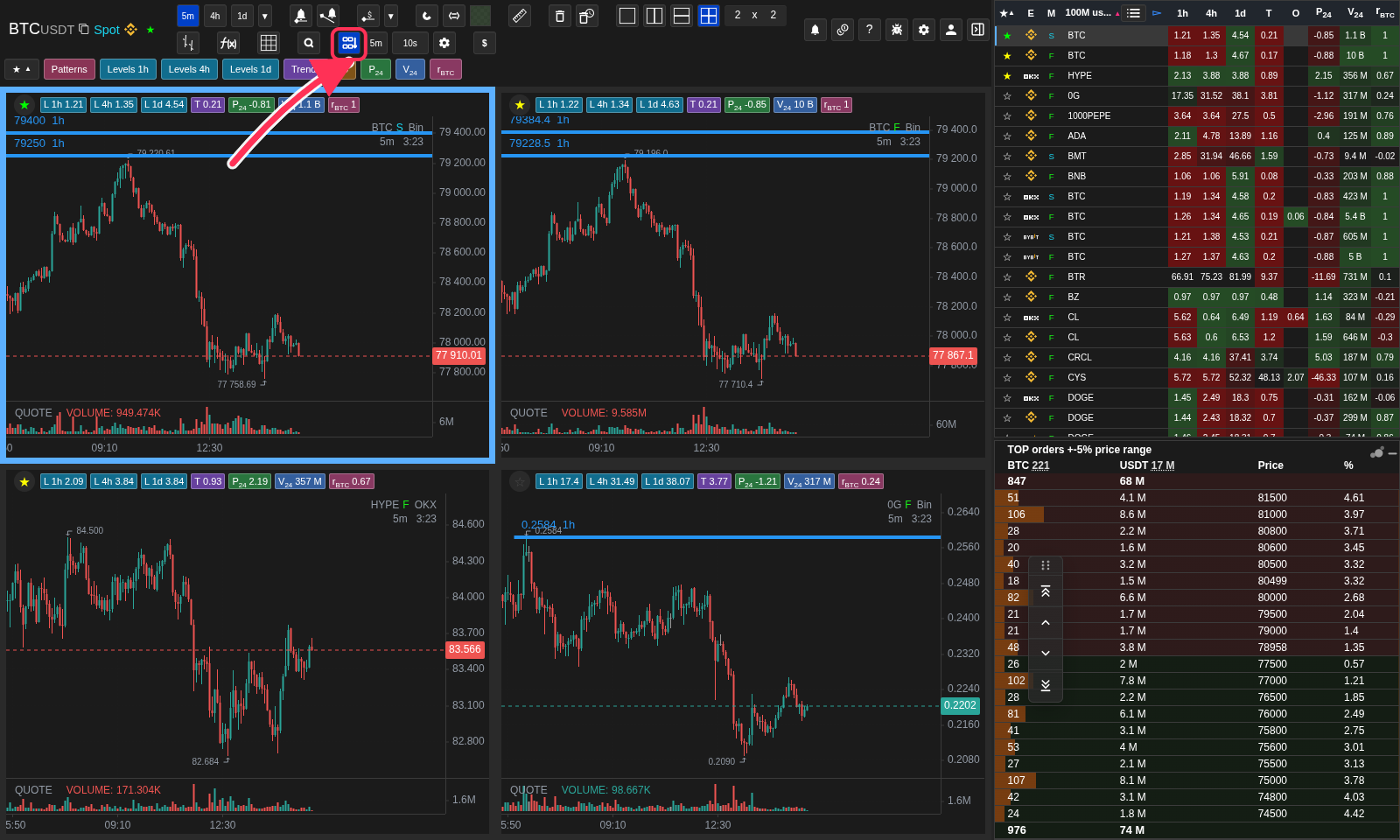
All charts with sorting and value panels
The coin list remains visible while enabled metrics appear above and inside charts.
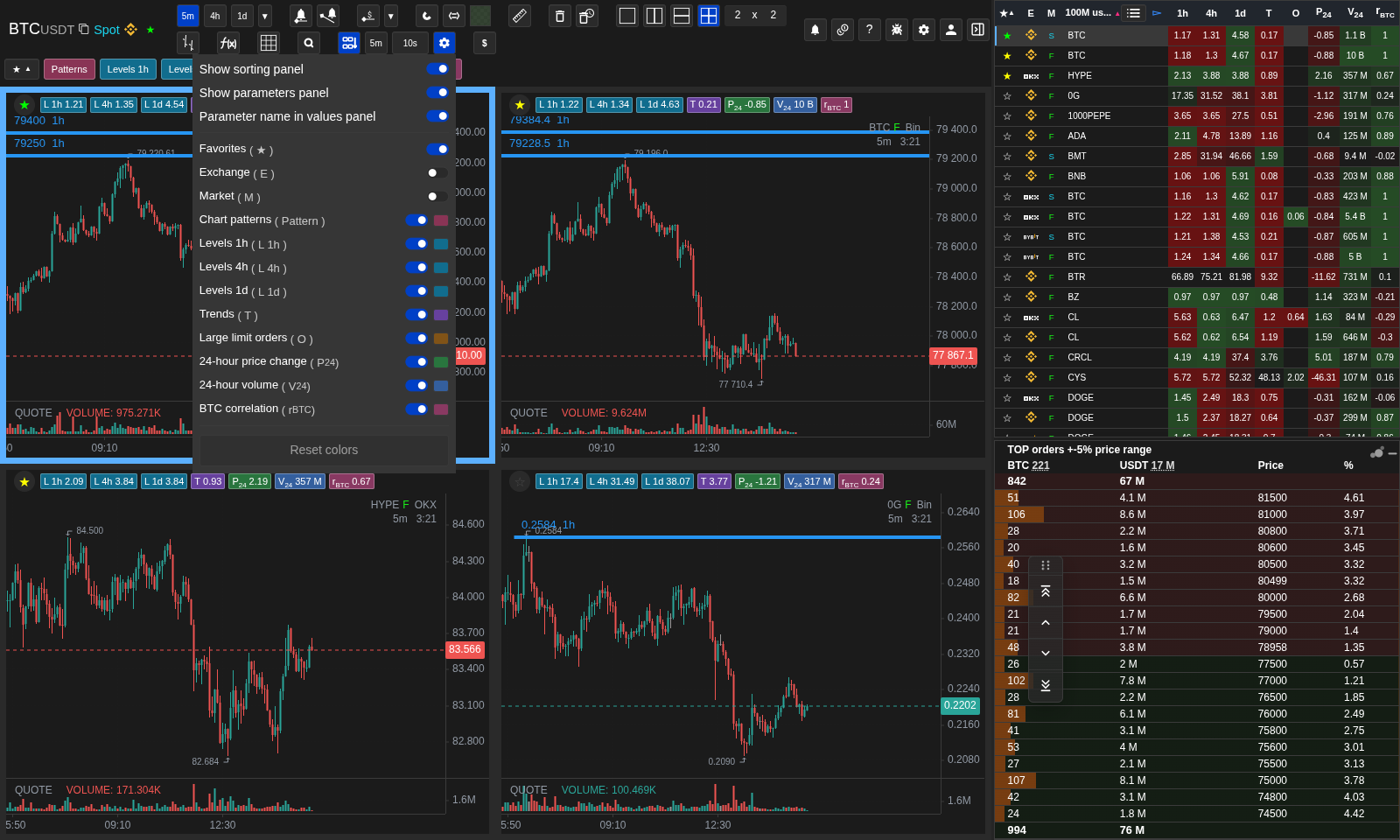
Panel and color settings
The gear controls both panels, labels, metric visibility, colors, and reset.
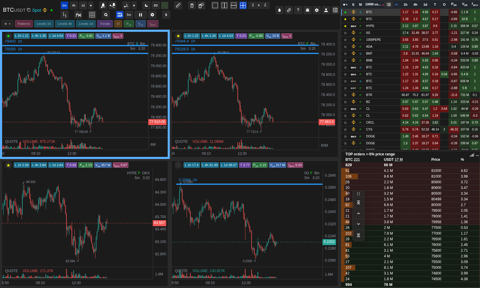
Automatic sorting paused
Interaction temporarily replaces the interval with Paused, then sorting resumes.
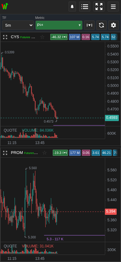
Mobile All charts
The header contains timeframe, metric, sort mode, refresh, and settings.
Operational notes
- All charts is not a saved grid. It does not overwrite the tickers, relation links, or overlay state of your ordinary saved grid.
- The current list is the source of truth. Adding, removing, or switching lists changes which coins can appear in the chart feed.
- The panels only offer the metrics available and included in the list. If the metric is disabled in the settings or not available to the coin, its button or value may be missing.
- Settings panels are stored separately from the general settings: panel visibility, signature, list of parameters and redirected colors should not be lost when storing another Settings section.
- Loaded visible and adjacent graphics keep the candles, accuracy, and scale position when switched if the ticker and timeframe match. This is a temporary snapshot for a smooth switching, not a permanent cache of the entire list.
- The manual sorting deliberately translates to the top of the new ranking. AutoThe mathematical reset keeps the selected coin and the current viewport's binding so that the view does not jump over without need.
- The scroll, the indicator, the navigator, the drawing or the pop-up controls temporarily suspend the rearrangement.
- If you select an automatic interval, the order may change as the values are updated.
- The overall timeframe is for this particular mode and is kept separate from the regular grid of graphs, so that all the candidates you can see can be quickly compared on the same candle scale.
- A floating leaflet is not required. It can be turned on or off in Settings → Common → Show the chart leaflet buttons.
- On very large lists, the graph data can appear gradually, which is normal: the mode prioritizes the visible area and the adjacent rows, and the list itself remains the sorting source.
- A high position in the chart is not a trade signal, it just means that the coin is high in the selected chart parameter and you need to manually check it on the chart.
- The new order is applied after changing the metric/mode, changing the structure or pressing the update button.
- The demo mode is enabled by default: P₂₄ down, automatically reset every 10 seconds and compile to 3×3 within the desktop window.
When to use it
- Use this mode when the list has already ranked coins and you want to check the charts one after another without clicking every ticker manually.
- It is useful for comparing many candidates by the same timeframe and the same sorting logic.
- Use manual mode when you want to keep the schedule orderly for viewing.
When not to rely on it
- Do not use chart position alone as an entry signal. The mode only visualizes list sorting.
- Do not expect this mode to save tickers into your ordinary grid. It is a temporary view of the current list.
- Do not use automatic refresh if you are carefully reviewing one part of a large list and do not want charts to change places.
Typical interpretation mistakes
- Confusing All charts with a saved grid. A saved grid is a fixed workspace; this mode is rebuilt from the current list.
- Leave an automatic update during manual scanning and assume that the app lost its schedule when the rating changed.
- Changing the list or sorting metric and expecting the old chart order to remain relevant.
- To count the "Pause" indicator as a data error it means a temporary stop on the switch for the time of interaction.
Algorithms and formulas to understand
- Why the chart feed follows the current list sorting rather than a separate saved grid order.
- Why does the manual keep the order of the charts stable while the list values keep updating?
- Why does the manual sort start the search from the first place, and the automatic keeps the selected coin and position.
- As a temporary snapshot of the uploaded chart, the candles and viewport state are moved to a new location without re-uploading.
- Why does user interaction temporarily stop the schedule.
- Why do you use a coin on the selected chart and use a link if it's on?
- Why is the common timeframe stored separately from the regular network timeframe?
- Why are mobile values updated separately from manual order switching?
- Why is a sorted graph tape convenient for visual verification, but not a substitute for manual verification of a trading idea?