Guide
Mobile and Android app
The mobile interface is designed for quick checking, symbol switching, alerts, charts by sorted list, and chart work on a small screen. It does not try to copy the full desktop workspace. Instead of showing several panels at once, it switches between focused views: list, chart, orderbook, large-order map, and charts by sorted list.
What this section covers
- How the mobile layout is organized: the main views are Notifications, List, Chart, Orderbook, large-order map, and Charts by sorted list. Header buttons switch between the views that are available for the current settings.
- How mobile list navigation works: tap a coin row to open it on the chart, use the search button to find a symbol, and use the autosort button when the current list should keep reordering by its saved sort.
- How Charts by sorted list works on mobile: it shows multiple compact charts ordered by a selected numeric list column. The header panel lets you choose timeframe, metric, sort direction, refresh values and sorting, and how many charts fit on the screen.
- How the selected Charts by sorted list parameter is shown: the dropdown uses color groups, and chart badges use the same color for the selected metric when that value is shown in the chart header.
- How opening a chart from Charts by sorted list works: tap the chart title to open the normal chart for that instrument. The normal chart uses the same timeframe selected in Charts by sorted list, and the back button returns to the same Charts by sorted list position.
- How mobile remembers the working entry point: if the last relevant screen in the navigation chain was Charts by sorted list, the signed-in user can return to Charts by sorted list on the next open; if it was List, the app returns to List. Chart, orderbook, and other detail screens do not override that choice.
- How mobile interface tours work: unsigned users can see a separate tour for each mobile screen. The "Interface tour" item in the menu starts the tour for the current screen, and each screen stores its own viewed flag locally.
- How the mobile chart differs from desktop: only one active chart is shown at a time, and chart controls are condensed into compact buttons and menus.
- How the orderbook works on mobile: it opens as a separate view for the selected coin, so the list and chart have enough screen space.
- How the mobile large-order map settings work: the settings button opens a sliding panel above the map with timeout, distance, threshold mode, and multiplier/value controls. The panel closes with × or a tap outside it.
- How dialogs work on mobile: notifications are available from the header bell, while list manager, settings, account, support, and help are available from the compact menu instead of the wide desktop header. For users who are not signed in, the mobile main menu also shows Pricing as the first item. The menu closes when you tap outside it.
- How the mobile notification feed works: tap a notification row to close the feed and open that coin on the chart. The feed remembers its scroll position during the running session so you can return to the same area of the list.
- How touch interactions differ from mouse interactions: tooltips and drawing controls use tap-friendly states; a selected figure can be deleted with the trash button, and if no figure is selected the same button enters red multi-delete mode instead of using right-click.
- How exchange-account markers work on mobile: trading markers use the same read-only exchange-account data as desktop. Tap a marker to show its tooltip for a short time; tap the tooltip to close it sooner.
- How Android sign-in works: Telegram auth links and email login open inside the app flow, so the app can finish authorization without relying on the desktop browser layout.
- How notifications work in the Android app: in-app alert toasts remain available, and supported alert events can also appear as Android system notifications when notification permission is allowed.
- How Open Interest appears on mobile: the OI column and tooltip follow the same settings as desktop, but the compact list may show fewer columns at once depending on screen width.
- How Funding appears on mobile: the F column follows the same list setting as desktop and shows current futures funding rate when the symbol has funding data.
- How Android updates are offered: when the Android version reported by the server is newer than the installed app, the update dialog links directly to the APK file on watchlist.top.
- Where to download the Android APK manually: open the web menu item "App" or the product description dialog and use the app_<version>.apk download link.
Key screens and controls
- Mobile list view with notifications, search, Charts by sorted list, autosort, and compact menu buttons.
- Mobile chart view for one selected coin.
- Mobile orderbook view opened from the selected coin.
- Mobile Charts by sorted list view with timeframe, metric, sort direction, refresh, and chart count controls.
- Mobile large-order map view, available when orderbook display is enabled.
- Mobile large-order map settings panel opened above the map.
- Mobile interface tour overlay for Charts by sorted list, List, and large-order map screens.
- Compact menu with Pricing for unsigned users, List manager, Settings, Account, Help, and Support, plus the separate notifications button in the header.
- Android notification permission prompt and an alert event shown as a system notification.
- Open Interest column in the compact mobile list with the same OI settings as desktop.
- Funding column in the compact mobile list.
Step-by-step flow
- Open the app on a mobile screen or in the Android app. The interface starts in a compact layout instead of the desktop multi-panel layout.
- Use the list view to select a coin. Tap the coin row to open it in the chart view.
- Use the bell button in the mobile header to open fired notifications. Tap a notification row to switch to the chart for that coin.
- Use the search button in the mobile list header when the list is long and you need a specific symbol.
- Use the Charts by sorted list button from the list header to open the mobile charts-by-sorted-list screen. Choose a timeframe, metric, sort direction, and chart count in the fixed panel under the main header.
- Tap the refresh button in Charts by sorted list when you want to take fresh metric values and rebuild the sorted order. The list does not continuously resort while you are scrolling.
- Tap a chart title in Charts by sorted list to open the normal chart for that symbol. Use the back button in the chart controls to return to the same Charts by sorted list position.
- If you are not signed in and the screen tour appears, go through it once or skip it. To start it again manually, open the compact menu and tap "Interface tour" on the current screen.
- Use the chart/orderbook buttons in the header to switch between the chart and the orderbook for the selected coin.
- Open the compact menu to reach List manager, Settings, Account, Help, and Support. Tap outside the menu to close it.
- For drawing tools on a touchscreen, select the tool from the chart controls and place points by tapping the chart. To delete one figure, select it and tap the trash button. To delete several figures, tap the trash button with no selected figure and then tap the figures on the chart.
- If trading markers are enabled through Exchange accounts, tap a marker on the mobile chart to read its tooltip. Use the $ chart-toolbar button to quickly hide or show the markers when at least one timeframe is enabled in Exchange accounts settings.
- If you use the Android app, allow system notifications when Android asks for permission if you want alert events outside the app surface.
- If the same account is used on desktop and mobile, desktop layout choices stay desktop-specific. Mobile uses its own compact working view instead of overwriting the saved desktop grid size.
Screenshots
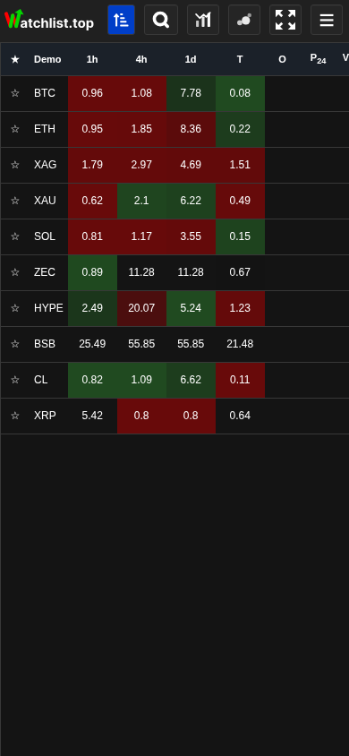
Mobile list view
The compact list header contains notifications, autosort, search, Charts by sorted list, large-order map, fullscreen, and menu buttons.
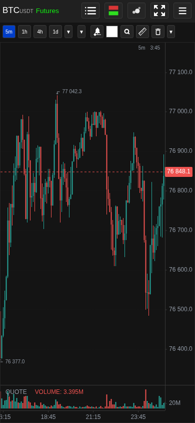
Mobile chart view
A selected coin opens in a single-chart layout with compact timeframe and tool controls.
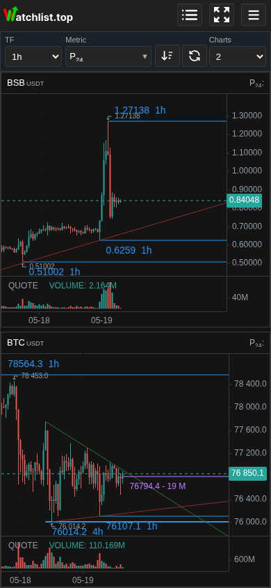
Mobile Charts by sorted list
The fixed panel controls timeframe, metric, sort direction, refresh, and chart count while charts scroll below.
Operational notes
- The mobile interface is intentionally denser and more sequential than desktop. Use it for checking and managing active instruments; use desktop when you need several charts and panels visible at the same time.
- Desktop grid size is not overwritten by opening the same account on mobile. The mobile view uses its own compact layout.
- Charts by sorted list saves its header choices to the account: timeframe, metric, sort direction, and chart count. Anonymous demo stores those choices locally in the browser.
- Mobile view state stores only whether the relevant entry point is List or Charts by sorted list. Opening Chart or Orderbook after that does not change the next-start preference.
- Mobile tours are screen-specific. Viewing the Charts by sorted list tour does not automatically mark the List or large-order map tour as viewed.
- The $ trading-markers button is shown on mobile chart screens only when Exchange accounts settings have at least one timeframe selected.
- Charts by sorted list uses a snapshot of current metric values when it is opened, when you change metric or direction, or when you tap refresh. This keeps scrolling stable while market values continue to update in the background.
- The nearest-order column is not available as a Charts by sorted list metric because it is an orderbook-distance signal rather than a stable chart-ranking metric.
- The large-order map button is hidden on mobile when orderbook display is disabled in settings.
- Some desktop shortcuts depend on a physical keyboard and are not useful on touch devices. Use the visible buttons and menus on mobile.
- The notifications button is kept in the mobile header so you can review fired alerts without opening the main menu first.
- OS/browser notifications and Android system notifications still require permission from the browser or operating system. The app cannot bypass a denied permission.
- Large lists can feel heavier on mobile. For print activity and other live stream features, prefer selected symbols over monitoring the entire list.
- OI data on mobile follows the same data source and settings as desktop. If the OI cell is empty, the feature may be disabled, the symbol may not have futures OI data, or the selected change value may not have enough history yet.
- Funding data on mobile follows the same source and settings as desktop. If the F cell is empty, the feature may be disabled, the symbol may be spot-only, or funding data may still be loading.
When to use it
- When you are using Watchlist.top from a phone, tablet, or Android app and the layout does not match desktop screenshots.
- When you need to understand where list, chart, orderbook, alerts, settings, and account controls moved in the compact UI.
- When Android notifications or mobile touch behavior need a separate explanation from desktop browser behavior.
When not to rely on it
- If the question is about detailed metric formulas rather than mobile layout.
- If you work only on desktop and need multi-chart workspace behavior.
Typical interpretation mistakes
- Expecting mobile to show the full desktop grid and orderbook beside the list at the same time.
- Assuming Android notifications will appear without OS permission.
- Thinking that opening the account on mobile changes the saved desktop grid size.
Algorithms and formulas to understand
- Why mobile shows one active chart at a time instead of the desktop grid
- Why mobile Charts by sorted list uses a saved metric snapshot and a manual refresh button instead of continuous resorting while you scroll
- Why Charts by sorted list applies its selected timeframe when you open a symbol in the normal chart view
- Why mobile remembers List or Charts by sorted list as the next-start screen and ignores intermediate detail screens for that choice
- Why mobile tours are stored separately for each screen
- Why the Android update link points to a versioned APK file on watchlist.top
- Why the mobile working layout does not overwrite the saved desktop workspace layout
- Why Android system notifications still depend on OS permission even when alerts are configured in the app
- Why the mobile notifications button is in the header and notification row clicks open the chart directly
- Why touch drawing uses selected-delete and explicit multi-delete mode instead of right-click deletion